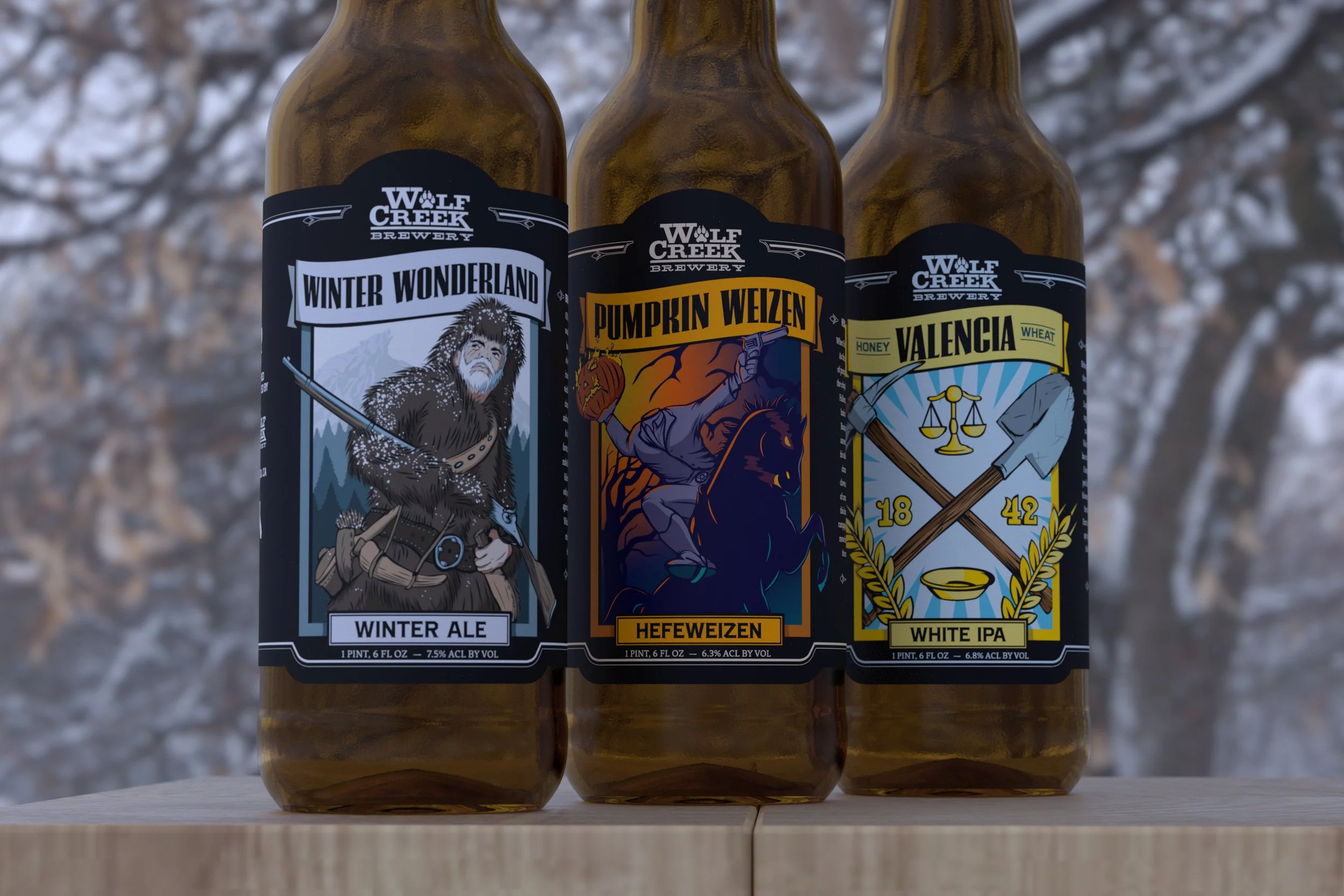
Wolf Creek Brewery // Craft Beer Packaging Redesign
Reviving a Classic
Designing a Label System That Honors Tradition While Competing in a Modern Market
Collaboration with La Visual, Inc.
BRAND FOUNDATION
Wolf Creek Brewery (WCB), one of the early pioneers in Southern California’s craft beer scene, faced a common challenge: their beer was beloved by regulars, but the brand wasn’t standing out on store shelves. Despite deep roots in the local community and a reputation for quality, the packaging system lacked visual consistency and stopping power in a highly competitive category.
The team approached us to refresh their identity through packaging—without losing the legacy that longtime fans recognized. Our goal was to develop a visual language that could connect across generations of beer drinkers, while making WCB more shelf-ready for broader retail opportunities.
VISUAL SYSTEM
We built the identity around a narrative-driven concept called The Wild West, referencing WCB’s pioneering spirit, familial heritage, and authentic regional roots. Each label featured a hero figure—animal or human—illustrated in high fidelity and paired with distinct brew names. These figures interacted with their environments, creating a sense of movement and character across the lineup.
To elevate shelf appeal, we introduced a bold color system that used vibrant accents without straying from the brand’s rustic soul. Typography was kept clean and legible to aid product clarity, while the label architecture allowed flexibility for seasonal or limited-run brews.
BUSINESS IMPACT
Following the rebrand, WCB expanded visibility in major retailers across Southern California, including wider placements in Whole Foods and craft beer specialty shops. The new labels generated attention in the craft community and earned positive feedback on design blogs and review platforms for their standout illustrations and collectibility.
The refreshed packaging helped reintroduce the brand to a younger demographic and boosted shelf recognition during a time when the regional beer market was becoming saturated with new entrants. The identity gave Wolf Creek a flexible, recognizable system that worked across flagship offerings and one-off batches—supporting both consistency and creative growth.


