Sagent // Fintech Loan Servicing Rebrand
Revolutionizing Loan Servicing
A Human-Centered Identity for the Future of Fintech
Collaboration with La Visual, Inc.
Note: While the final identity was never implemented by the client, this work represents a full engagement and the strategic direction approved during development.
Strategy & Concept
Sagent, a leading fintech company, set out to reimagine the future of loan servicing and homeownership. Their goal was to simplify and secure the lending process for millions — not just through automation and innovation, but by placing people at the heart of every experience. The brand challenge: create an identity that reflects their mission to transform the loan servicing industry with technology and empathy.
Our strategy was to channel Sagent’s bold, inventive spirit — a team of change-makers driven to disrupt the status quo. Their conversational tone, human-first philosophy, and forward-looking solutions informed every aspect of the branding. The positioning statement, “The only fintech company revolutionizing the servicing industry through automation and innovation to benefit humans,” became our north star.
Inspired by Thales’ Circle Theorem, we introduced the concept of Flight — a symbol of Sagent’s ability to help customers rise above complexity and see a clearer financial future. A wing in motion became the metaphor for innovation, insight, and momentum.
Execution
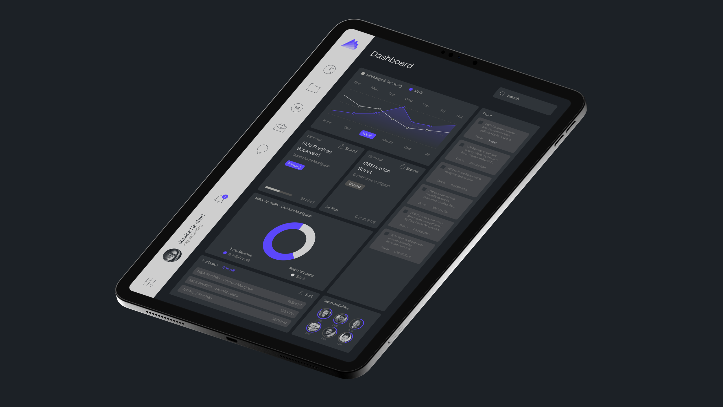
The final identity system drew from the Flight concept, with a logo built around an asymmetrical wing enclosed in a circle — signaling elevation, balance, and precision. The logo paid homage to both ancient wisdom and modern progress, capturing Sagent’s dual identity as both a trusted guide and a tech disruptor in financial services.
A custom pattern system emerged from the logo’s geometry, creating a dynamic and cohesive brand toolkit. The color palette featured cool greys and blacks, brought to life with Aeros Purple — a vibrant tone chosen to reflect energy, innovation, and optimism. The brand’s contemporary sans-serif typeface, Mori, reinforced its confident, accessible personality.
The result was a bold brand built for the future — one that encapsulates Sagent’s mission to rewrite the future of loan servicing through human-first innovation, reliability, and clarity.